Oliver Bonas X Fedrigoni
Packaging
Competition - YCN
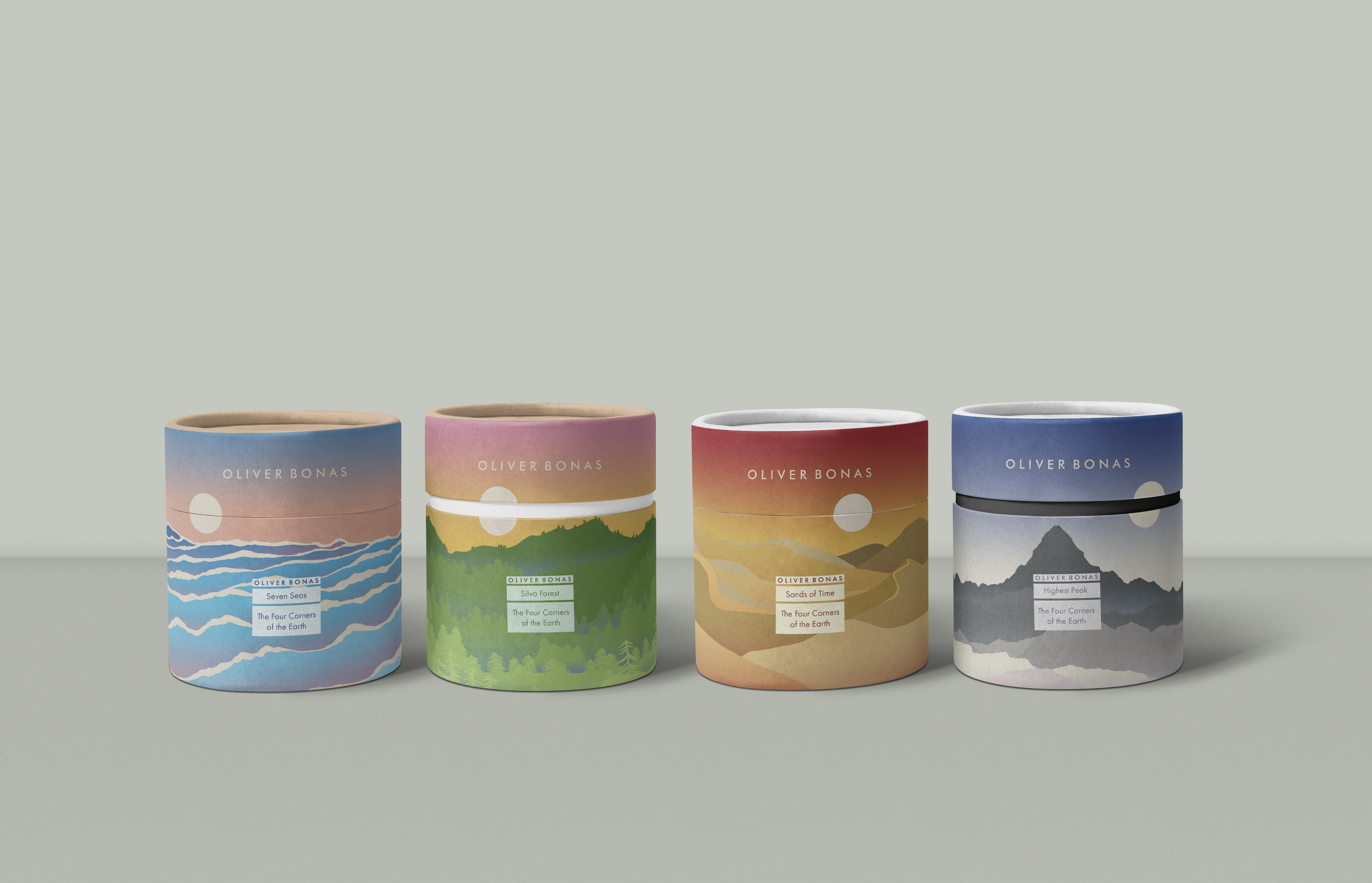
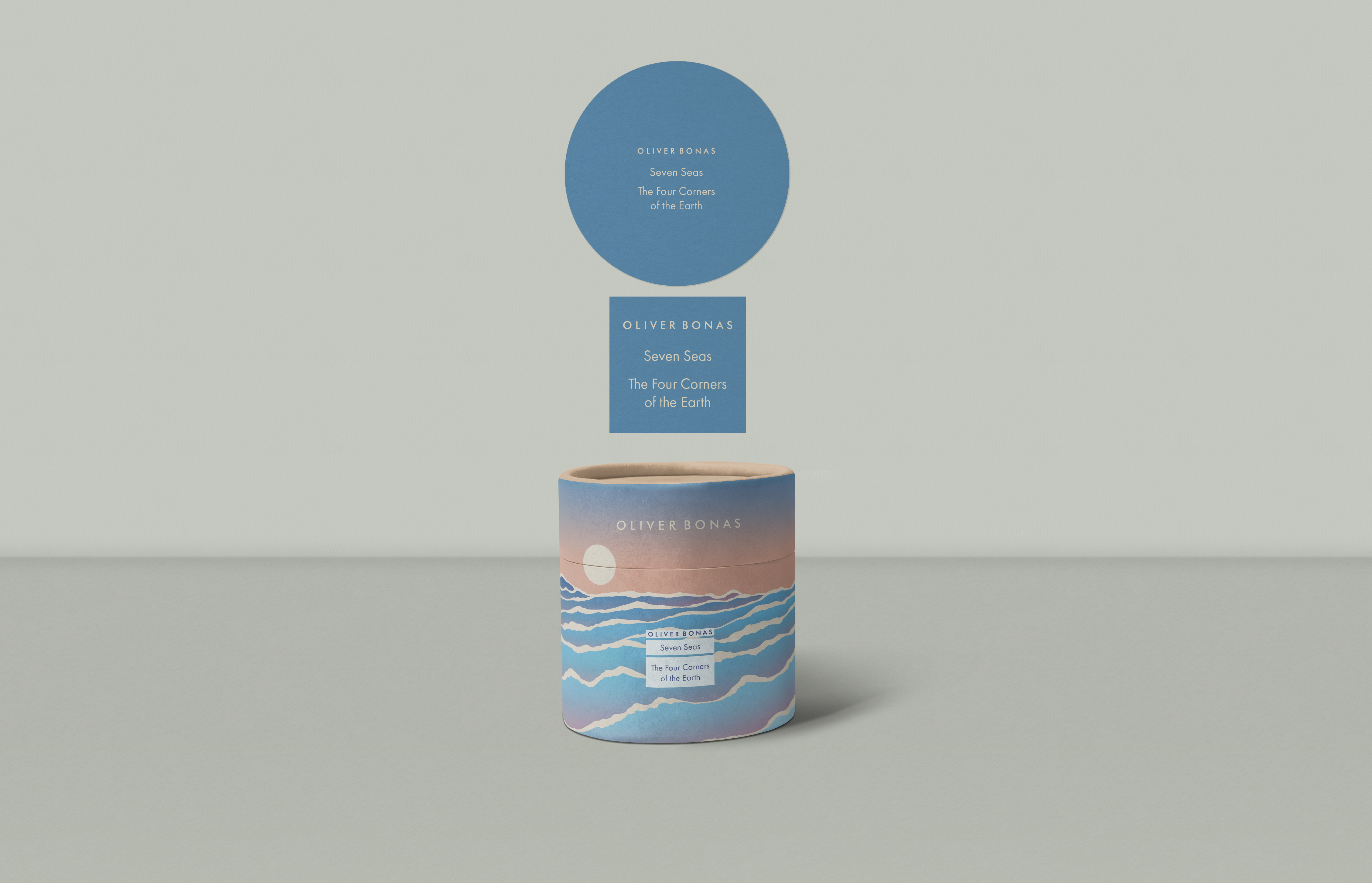
‘The Four Corners of the Earth’ was an entry for the YCN competition, a collaboration between Oliver Bonas and Fedrigoni Paper. The brief called for four candle packaging designs that needed to be simple yet impactful, using a specific color palette. All that was provided to start the project was a mood board and the title "Tierra," meaning "Earth" in Spanish.
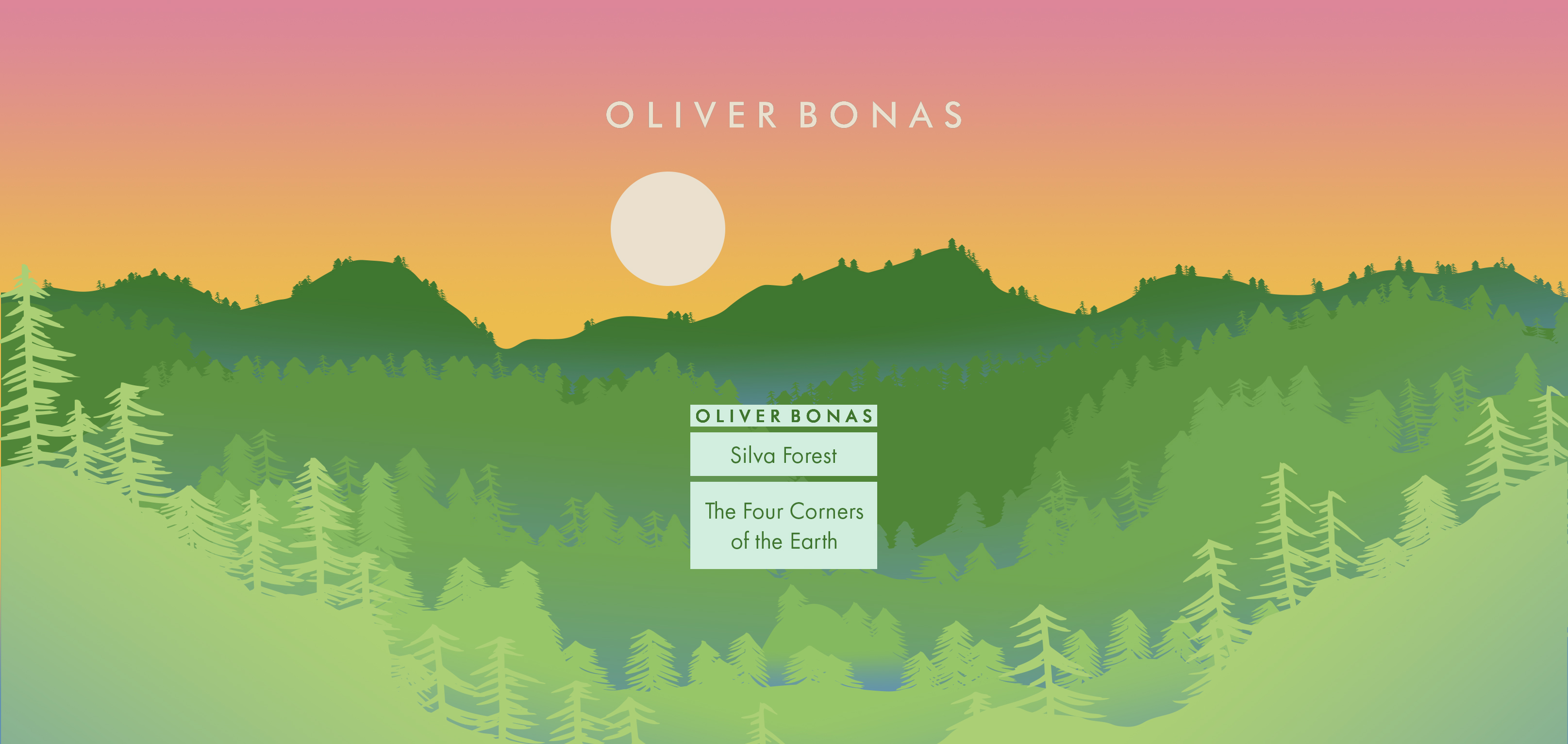
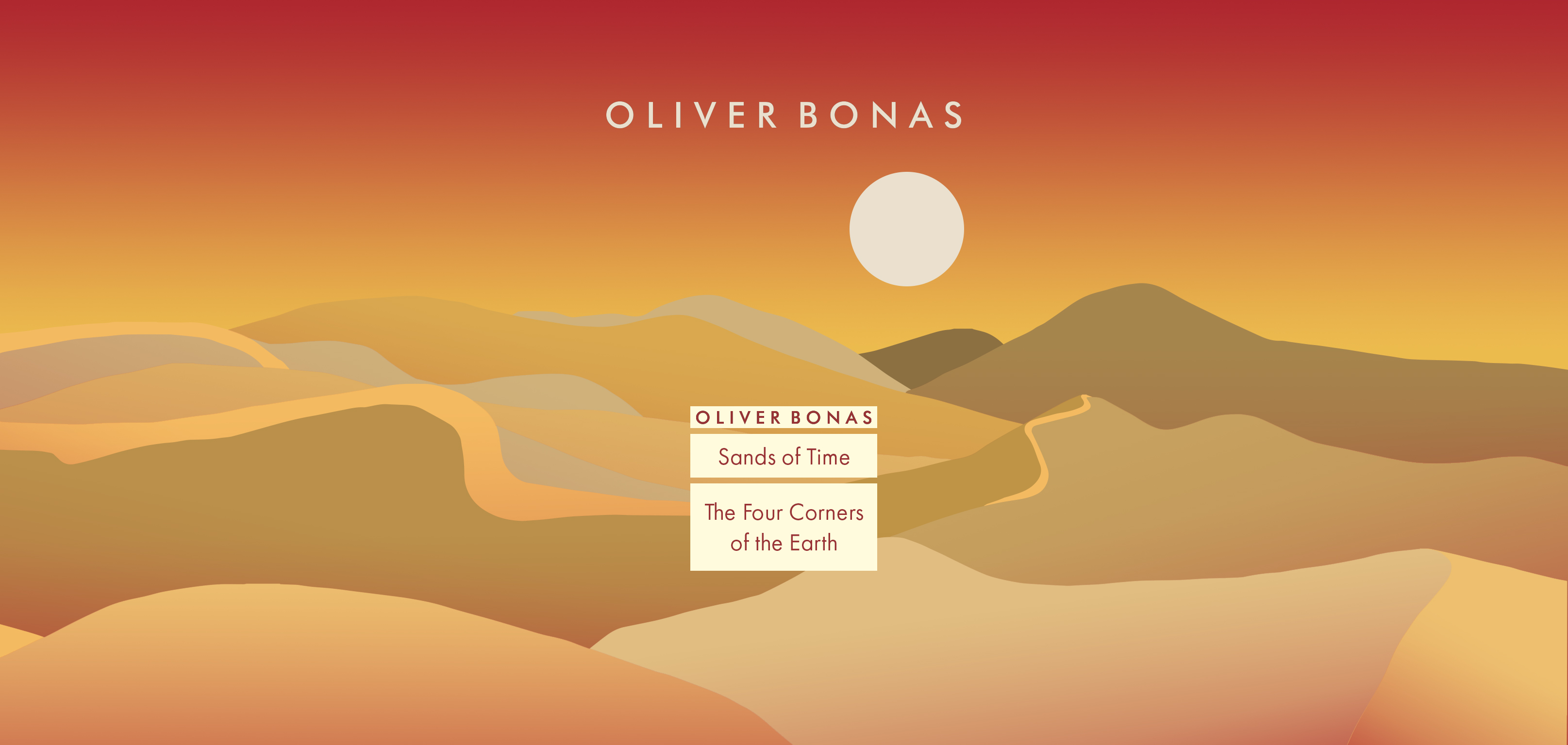
The designs represent the four main landscapes and habitats of the Earth, each with its own distinct set of colors, styles, and imagery. The focus was on the terrain and the layers of each location, capturing the essence of each environment in a way that both reflects and highlights its unique qualities.


This is a great explanation of your design approach and the conceptual references behind each candle name. To enhance clarity and flow, I’ve made some adjustments to tighten the language and improve readability:
Due to the variety of styles and imagery used across each design, consistency was maintained through the layout. Each design follows a similar structure, starting at the bottom and progressing backward to create a sense of depth. The peaks in each landscape are placed just beneath the separation between the lid and body of the packaging, highlighting the contrast, yet they are visually connected by the moon or sun, which serves as an alignment tool when reconnecting the lid and body. The lid then transitions into a solid color, echoing the hue used for the top of the lid and the label on the vessel inside.
The names of each candle were inspired by various cultural and natural concepts:
Seven Seas – Not only a reference to the world’s oceans, but also a term commonly used in sailing culture and maritime terminology.
Silva Forest – Named after the Black Forest in Germany, originally called Silva Nigra by the Romans.
Sands of Time – Alluding to both the sand in an hourglass and the broader concept of time itself.
Highest Peak – Referring to the tallest mountain on Earth, Mount Everest, symbolizing an ultimate achievement that only the most accomplished can reach