Cat N’ Mouse Brewery
Branding
Self-Initiated


Cat N’ Mouse Brewery is a fictitious brand identity created to make IPA and pale ale more inclusive by appealing to all genders. Research shows that while women fit within the target psychographic for these drinks, they often avoid them due to the traditional male-dominated image of the category. This brand aims to break that stereotype, offering a welcoming and inclusive approach to craft beer.

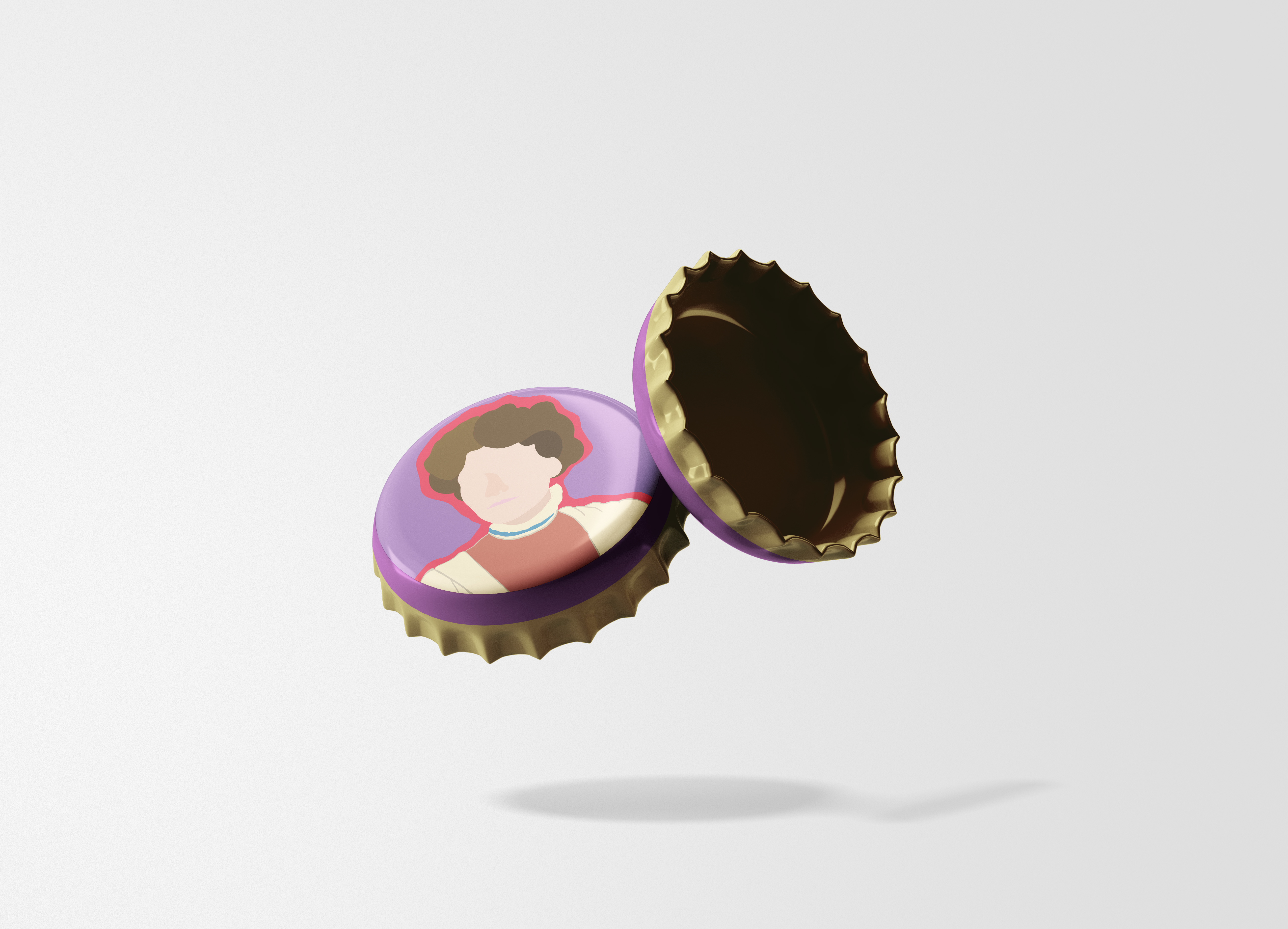
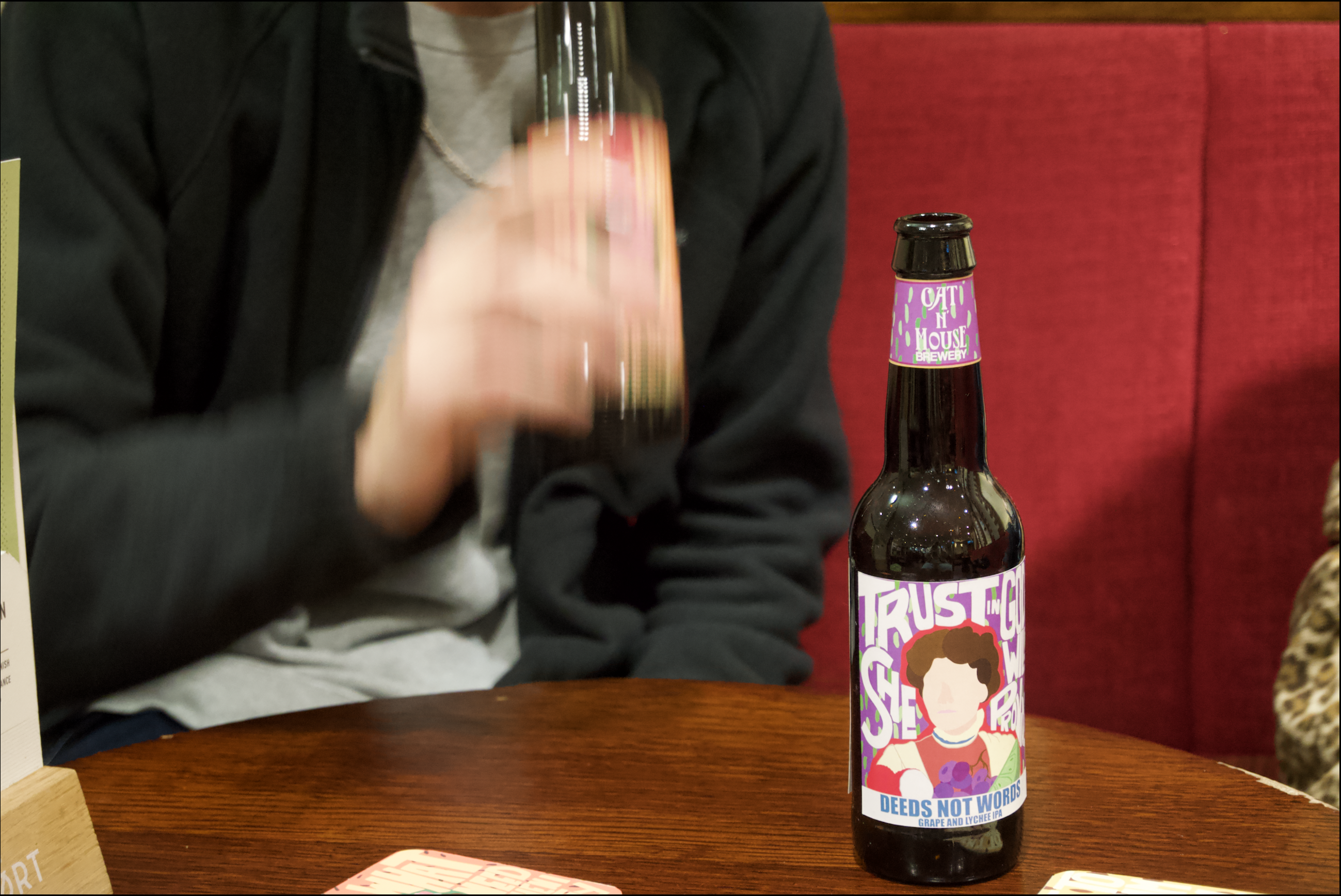
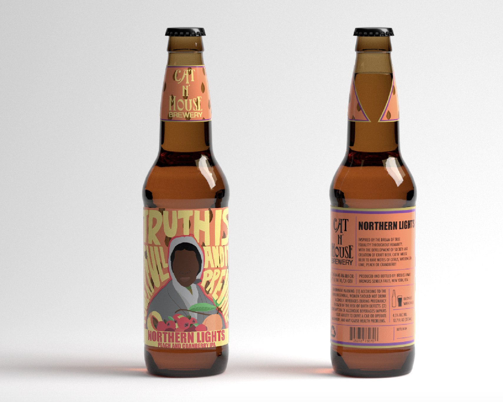
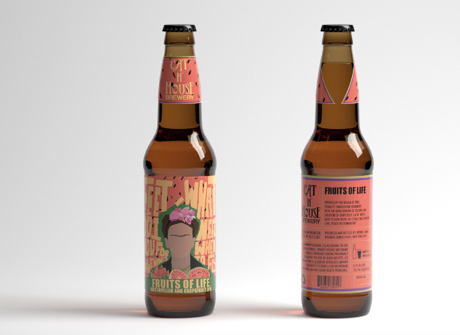
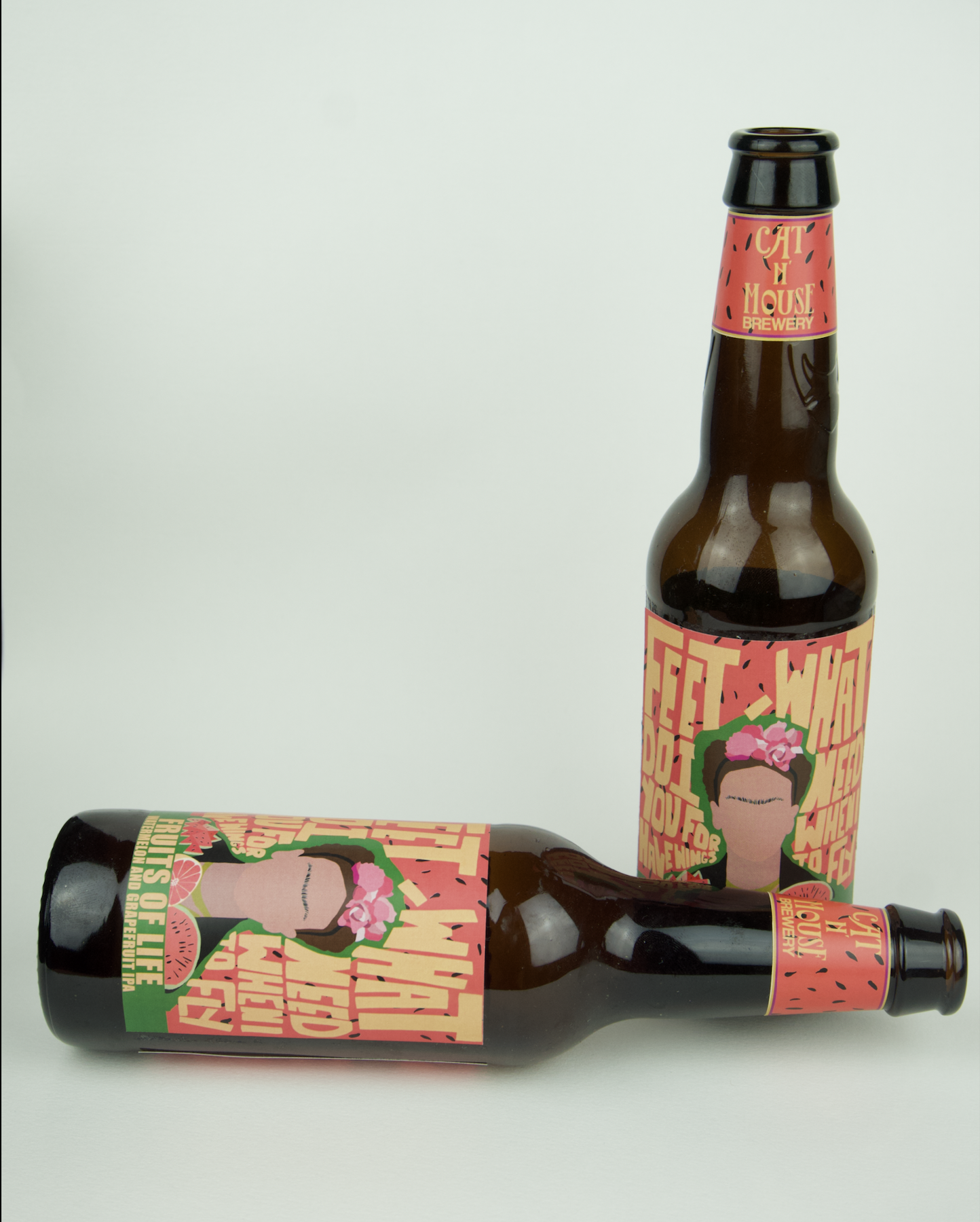
The logo is inspired by a suffragette leaflet from the time of their activism, subtly nodding to the profound impact the suffragettes had on the feminist movement. The four bottle designs each represent a historical woman who made a significant impact, showcasing the diversity and inclusivity at the heart of the brand. The women chosen are Frida Kahlo, Mary Shelley, Sojourner Truth, and Emmeline Pankhurst—each representing a unique set of ideas and life experiences, from their personal histories to the broader movements they influenced.
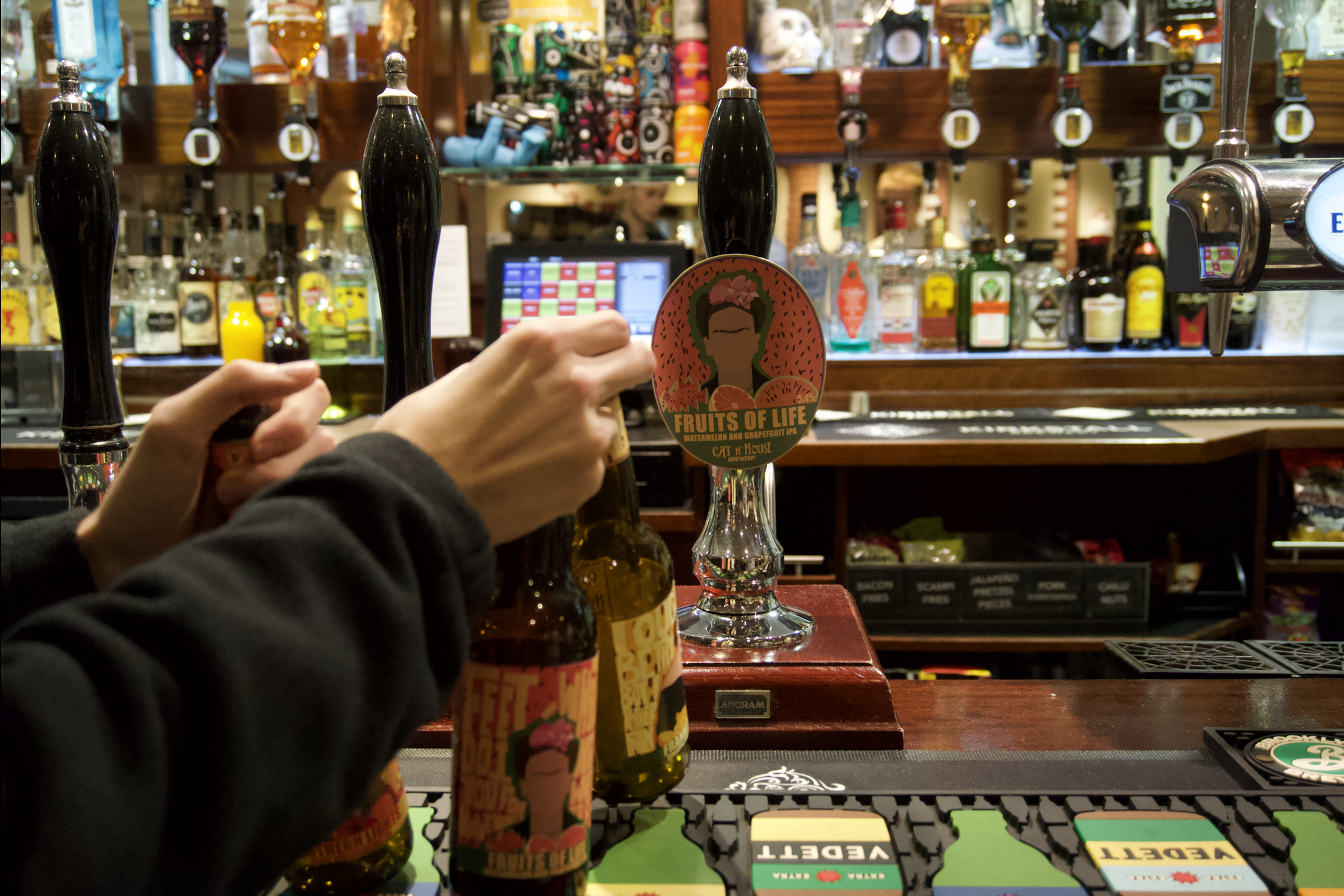
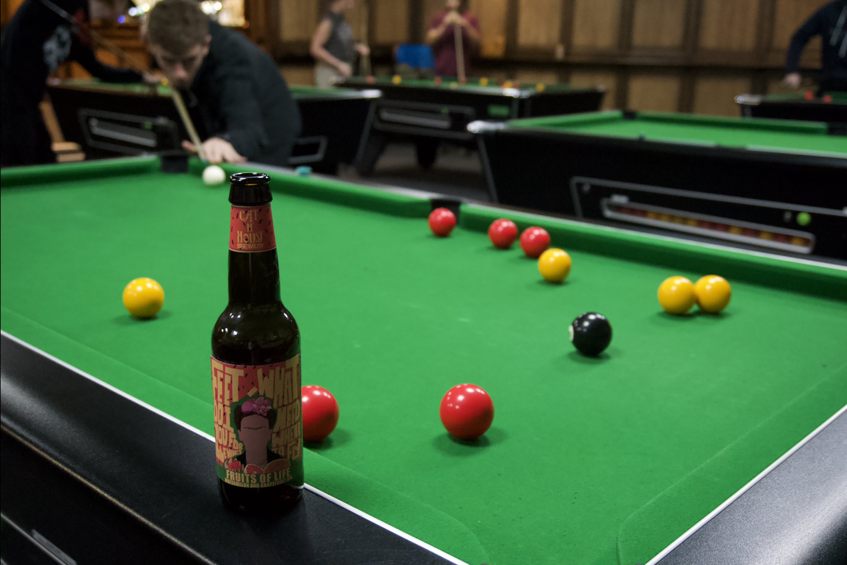
The design of each bottle merges both the person and the flavor. Each label features colors associated with the flavor profile, while integrating famous quotes from the women themselves. The illustrations are minimalist yet capture key characteristics of the women, emphasizing their individuality and the diverse contributions they made.
The purpose of this brief was to address the gender disparity in IPA consumption, where a significantly smaller proportion of women drink IPA compared to men. Research revealed that much of this is due to the design and identity traditionally associated with these products. Additionally, group discussions with the target audience highlighted that the way flavors are represented plays a significant role in shaping consumer perception and response.

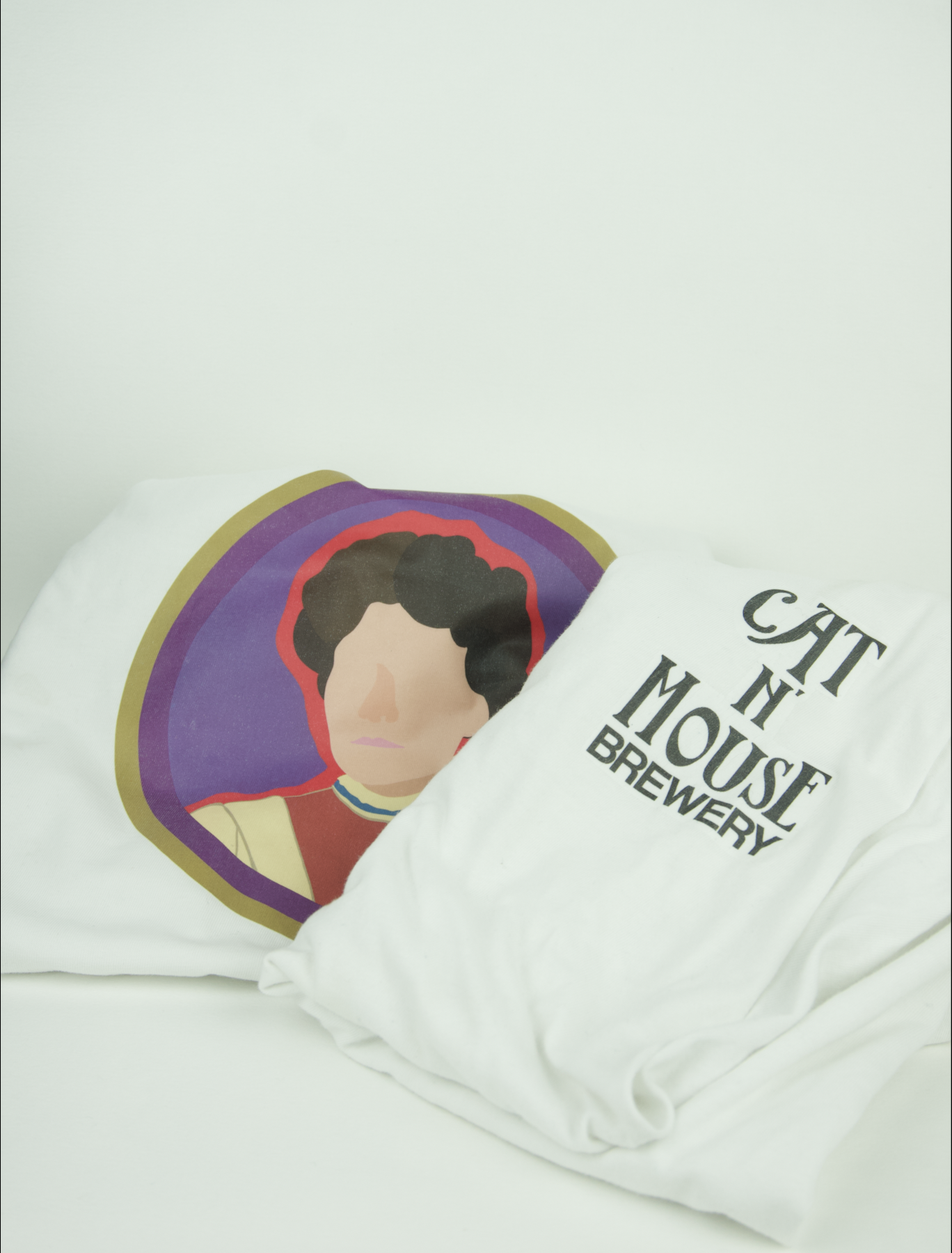

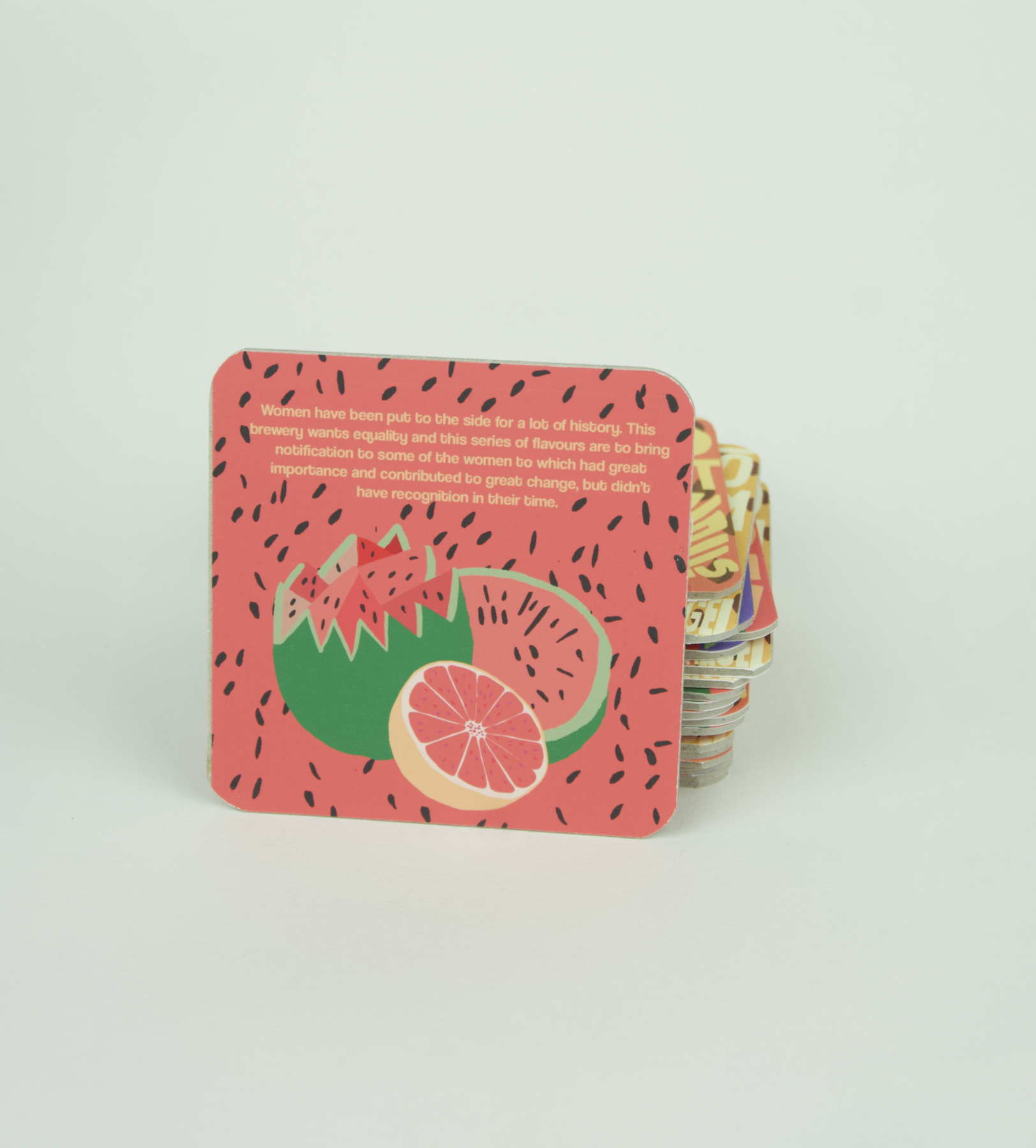

A range of products were created as part of this project, including bottle labels, caps, coasters, beer tap clips, stickers, and t-shirts, all designed to establish a cohesive IPA brand identity. While each product plays a role in maintaining brand consistency, the bottles and coasters are the main focus, as they best embody the core intention behind the brand.
An interesting challenge within the brief was designing a product that stands out in an industry where every piece of packaging is crafted to be unique, contributing to an over-saturated market. This process required balancing originality with the need for differentiation in a highly competitive space.
An interesting challenge within the brief was designing a product that stands out in an industry where every piece of packaging is crafted to be unique, contributing to an over-saturated market. This process required balancing originality with the need for differentiation in a highly competitive space.